Judge a Book By Its Cover!
This week it's all about judging books by their covers! Pick a book--any book, really--and search out multiple book cover images for that book. They could span a decade or two (or more)...Or they could span several countries. Which cover is your favourite? Which one is your least favourite? Which one best 'captures' what the book is about?
Further details on Weekly Geeks found here.
I’ve decided to focus on Brave New World by Aldous Huxley.
My favourite covers are #4 and #10, my least favoured are #3, #5 and #9.
If you judged a book by it’s cover, which of these Brave New Worlds would you be more likely to pick up?
Which would you pass right by without a second glance?
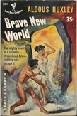
| #1 – Chatto and Windus 1932 | #2 – Bantam 1952 |
 This is a first edition cover and for the age of it I like the use of color as a way of showing separation. This is a first edition cover and for the age of it I like the use of color as a way of showing separation.
|  Lol – I love these pulp-style covers, and as horrid as this looks it does contain the savage, the desirable woman and the modern city in the background. Lol – I love these pulp-style covers, and as horrid as this looks it does contain the savage, the desirable woman and the modern city in the background.
|
| | |
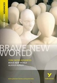
| #3 – Flamingo 1977 | #4 – Harper Perennial 1998 |
 This is a cover that I hate, the clones are appropriate to the book, but it reminds me of the movie I, Robot (which I was not impressed with) This is a cover that I hate, the clones are appropriate to the book, but it reminds me of the movie I, Robot (which I was not impressed with) |  Clones again, yet I like this cover for the way they are presented as faceless, sexless, and all marching to the same beat. There is something attractive about the color scheme also, with the glare of white representing their ‘good’ origin. Clones again, yet I like this cover for the way they are presented as faceless, sexless, and all marching to the same beat. There is something attractive about the color scheme also, with the glare of white representing their ‘good’ origin.
|
| | |
| #5 – Penguin Readers UK 1999 | #6 – Vintage Books 2004 |
 I see this representing one person among a group who cannot conform – but it would be more appropriate to have a male because Lenina, the main female in BNW is more conformist than not. |  Again the faceless being is related to everyone being the same and the fetus could be seen as a representation of how babies are being pre-designed and mass produced. A product rather than a person. Again the faceless being is related to everyone being the same and the fetus could be seen as a representation of how babies are being pre-designed and mass produced. A product rather than a person. |
| | |
| #7 – HarperCollins 2004 | #8 – Harper Modern Classics 2005 |
 The capsule is a great reference to SOMA – a drug in BNW used to control people. “"All the advantages of Christianity and alcohol; none of their defects." The capsule is a great reference to SOMA – a drug in BNW used to control people. “"All the advantages of Christianity and alcohol; none of their defects." |  Since people in BNW were judged alot on materialistic things/looks, this blue-eyed, blond-haired mannequin-like face strikes me as making a connection to the Aryan power movement. |
| | |
| #9 – Pearson Longman 2005 | #10 – Harper Perennial Modern Classics 2006 |
 More faceless, mannequin like clone troops. Not too original and a bit more bland than the others. The title design in this one is a complete turn-off, it blends into the background and it’s strangely spaced. More faceless, mannequin like clone troops. Not too original and a bit more bland than the others. The title design in this one is a complete turn-off, it blends into the background and it’s strangely spaced. |  The mixture of technology with humans is a good connection. The gears could be taken to mean every person is engineered to smoothly interact with all others to make the world one machine comprised of parts that don’t work individually. The mixture of technology with humans is a good connection. The gears could be taken to mean every person is engineered to smoothly interact with all others to make the world one machine comprised of parts that don’t work individually. |
| | |
| #11 – Vintage Canada 2007 | #12 – Penguin 2008 |
 The egg is another reference to the design and incubation of humans. The zipper perhaps saying that the human inside has no control, rather it is the creator that decides when they are ready to hatch. The egg is another reference to the design and incubation of humans. The zipper perhaps saying that the human inside has no control, rather it is the creator that decides when they are ready to hatch. |  This is the only cover that focuses on the creator of the brave new world, although his clones are still present as he seems to watch over them. For me it is a little too reminiscent of 1984’s Big Brother ideal. This is the only cover that focuses on the creator of the brave new world, although his clones are still present as he seems to watch over them. For me it is a little too reminiscent of 1984’s Big Brother ideal. |
© 2008-2010 Joanne Mosher of The Book Zombie. All rights reserved.


14 comments:
I have not yet read this but my faves are #4 and #9 but I must admit #10 is really cool.
I've seen #4 in the stores. But I really liked #12 even though it is pretty creepy
I haven't read the book, but I think my favorites are #7 and #12. This has been a fun weekly geeks.
I'm with you on 3, 5 and 9. 12 gives me the creeps! I think I'd go with the original cover.
While I love the original cover, for a book that I've yet to read the plain Vintage version (the one with the baby) calls to me, for one reason or another :)
Such an interesting variance in the covers for this one! Not many of them seem alike at all and it's difficult to tell which best portrays the overall theme of the book. I think I like #8 and #9 best.
#1 and #10 are my favourites...I can't say I like #3, #5 or #8.
I kinda like the 1st one the most.
I like #1 and #11. Abstract works better for me in illustrating this book.
My favorite is #11. I also like #1 and #10.
I love #6 and #10 the best. :)
#1, 2 and 8 are ok.
The rest I would pass up on.
interesting book pick! I'm creeped put by eyeballs so I dont like 12 and 8. But I like the #2 cover.
http://thebookworm07.blogspot.com/
Wow, all of them look pretty freaky to me! Great, but freaky, just like the book.
I kind of like #1, #7, and #10 but I agree with you on #3 and #9. There is nothing eye-catching or even interesting about either. I would just walk right past it in a bookstore or even a library.
Post a Comment